Eversify Kiosk Themes
THE CHALLENGE
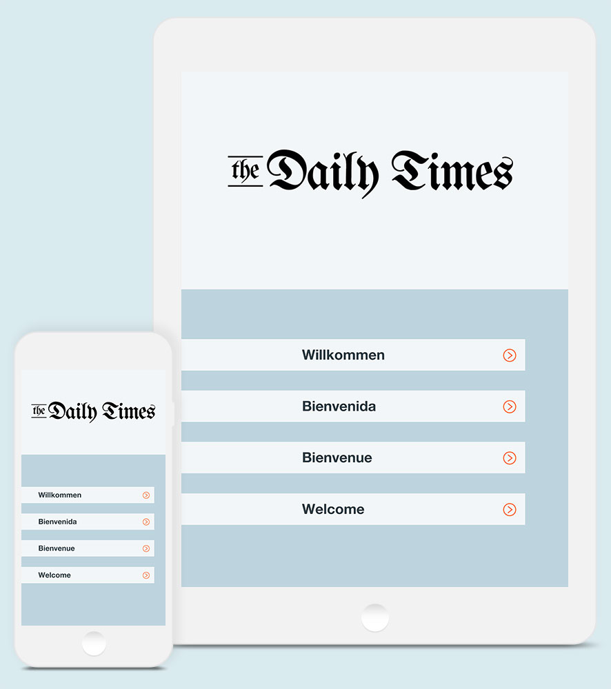
The reader kiosk provides an entry point for news consumers to browse multiple publications from the same publisher, find and download back issues, and manage their content. The original Eversify kiosks were not user-friendly, having suffered from feature after feature being added to a design that had not anticipated these additions. New kiosk templates were needed, ones that took into account the different types of publications (newspapers and magazines), and how readers of these types of publications consume their news.
THE PROCESS
Working together with the project manager, sales, and other stakeholders, I developed user flows for navigating a kiosk. We defined the key user tasks as:
- Downloading and reading the latest edition of the primary publication.
- Accessing past editions of the primary publication.
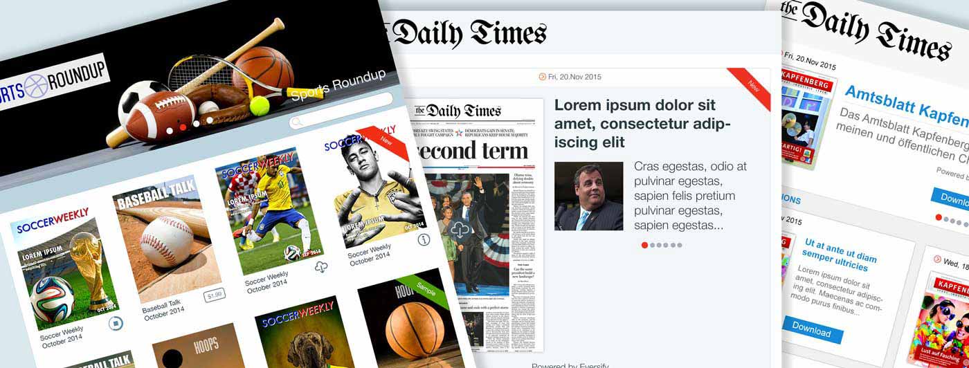
- Awareness of other publications offered by the same publisher.
- Knowing when new content was available.
- Access to a sample edition, if the user does not have a subscription.
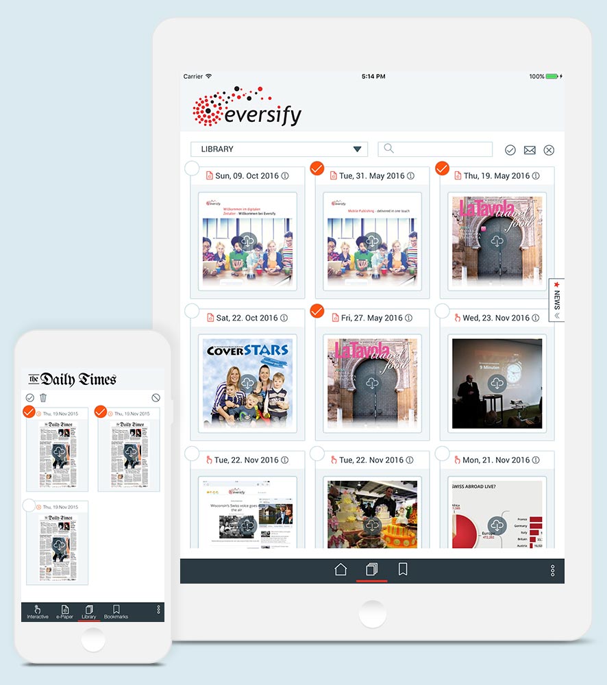
- Managing a user's downloads. Accessing previously downloaded editions, and deleting old editions that the user is finished with.
From here, I began to wireframe ideas in Axure. This allowed me to create a rapid, low-fidelity prototype that the user could interact with.
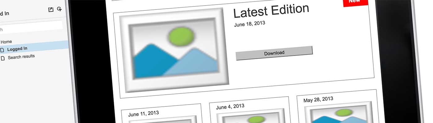
While working in Axure, I was able to explore different layouts, different interactions, and different ways to solve the key user needs outlined above, through quick iterations of ideas.
When we had decided on the best solutions, I then moved on to high-fidelity mockups. Three divergent ideas had grown out of the process. We named these after streets near the office: Hillcrest, Borchard, and Newbury.
Hillcrest Theme
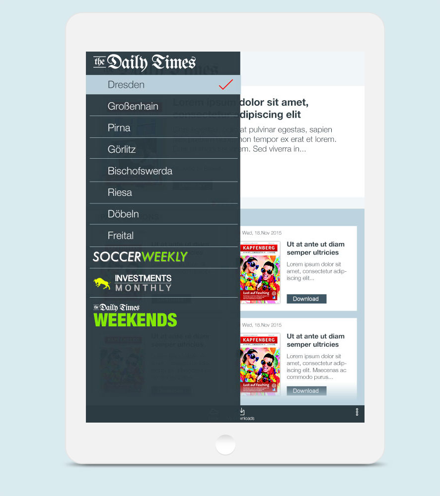
Hillcrest was the name of the theme derived from the early wireframe seen above. Past editions had changed from page swiping to infinity scroll. Access to other publications changed from an ever-present spot on the main kiosk to being higlighted in a slide in app menu.
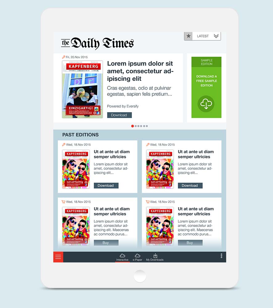

Borchard Theme
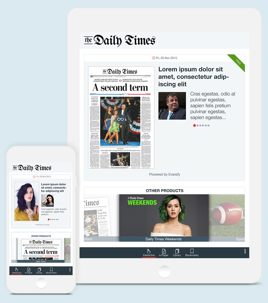
Borchard provided an alternative for newspaper publishers to Hillcrest. The focus for Borchard was on the current edition, based on feedback that end users were primarily concerned with the current day's news. Past editions were still available in an archive, accessible from the kiosk's main navigation. Other products, links to external sites, and advertisements were placed into an optional slideshow at the bottom of the kiosk.
Newbury Theme
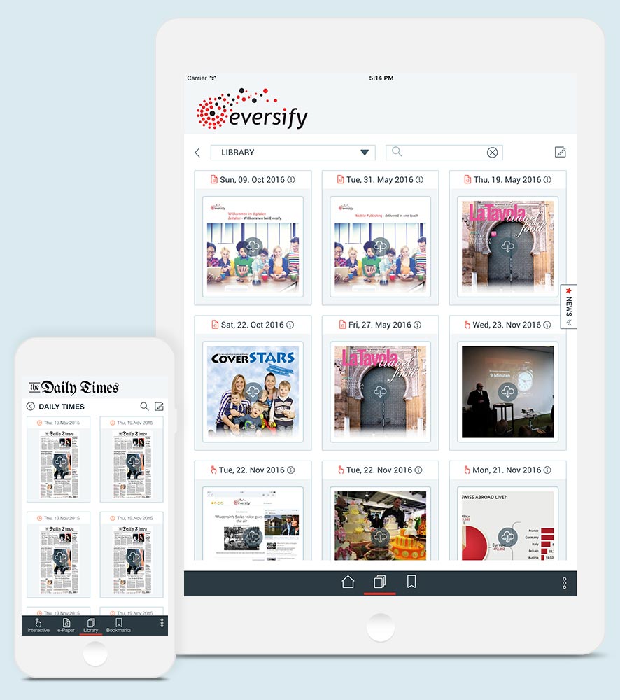
Newbury was primarily aimed at magazine publishers. Since magazines generally publish weekly or monthly, there is less focus on the breaking news of the day. Users are more likely to download past editions. This resulted in a grid for all views, allowing the user to filter down to specific publications via publication slides at the top, a popover menu, and by searching metadata.